Sample Jupyter Notebook
(The example used here is based on6. Photometry)
First, set up the environment:
[1]:
import matplotlib
import matplotlib.pyplot as plt

try:
    from IPython import get_ipython
    get_ipython().run_line_magic('matplotlib', 'inline')
except AttributeError:
    print('Magic function can only be used in IPython environment')
    matplotlib.use('Agg')

plt.rcParams["figure.figsize"] = [15, 8]
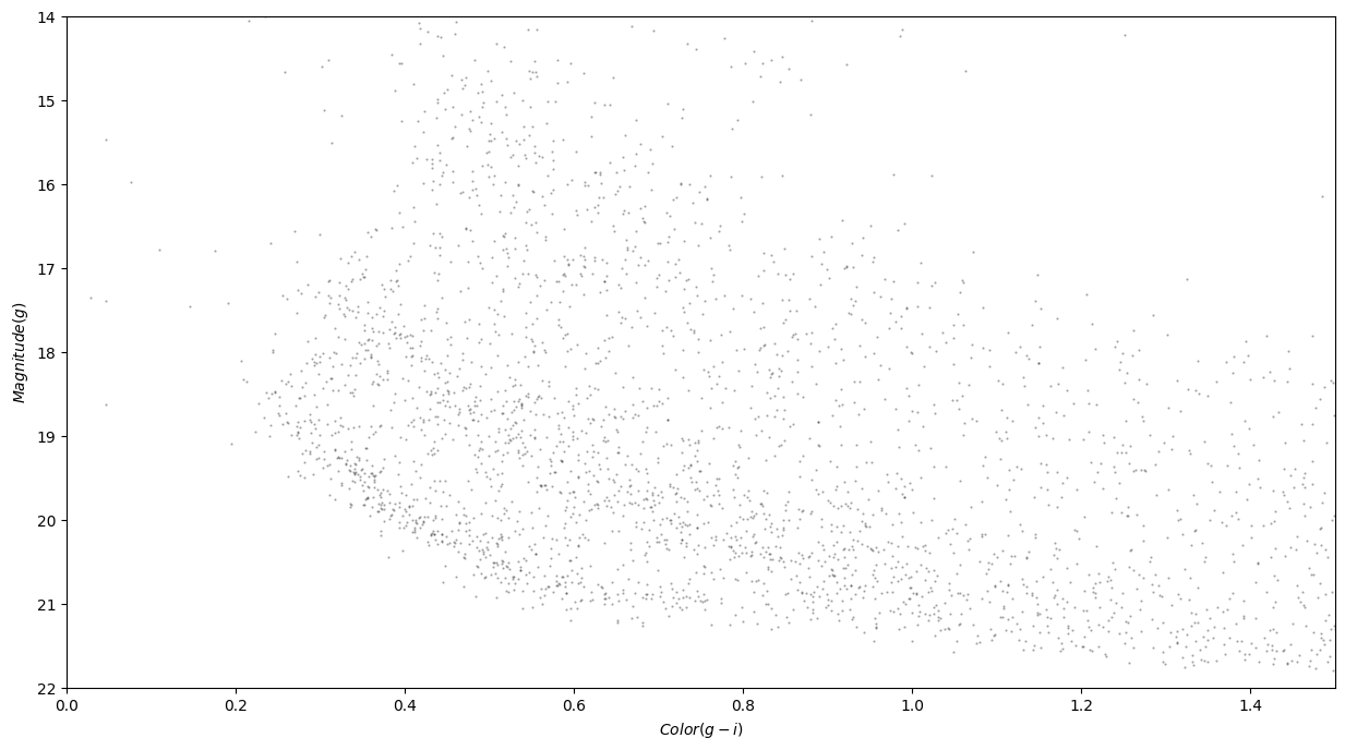
Then, define a function that creates a pretty graph:
[2]:
def plot_cmd(table):
    """Plot a color magnitude diagram.

    table: Table or DataFrame with photometry data
    """
    y = table['g_mean_psf_mag']
    x = table['g_mean_psf_mag'] - table['i_mean_psf_mag']

    plt.plot(x, y, 'ko', markersize=0.6, alpha=0.3)

    plt.xlim([0, 1.5])
    plt.ylim([14, 22])
    plt.gca().invert_yaxis()

    plt.ylabel('$Magnitude (g)$')
    plt.xlabel('$Color (g-i)$')
Finally, call that function to display the graph:
[3]:
import os
import pandas as pd

from pathlib import Path

test_dir = os.path.dirname(os.path.dirname(Path().resolve()))
path = os.path.join(test_dir, "data", "gd1_data.csv")
df = pd.read_csv(path)
[4]:
plot_cmd(df)